

Unfortunately there are no good official pics of the Mattel PowerCon reveals. There are a few tiny, watermarked images on Mattycollector that do the figures no justice and are really just sad. The best pics I’ve found are in this post on the Fwoosh, so that’s what I’ll be referring to in this article.
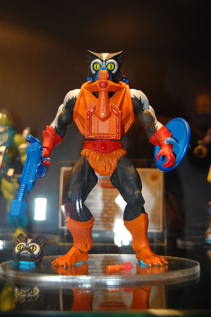
First up: Stinkor. You know, for all we’ve been told about how the designers have been told to minimize the Millennium features on MOTUC figures, we’re getting an awful lot of Millennium features on these figures. Stinkor gets a new gun, stink-tanks on his back, and a Millennium-style head (along with a repainted Mer-Man vintage head). I’m not the biggest Stinkor fan. He was a bit too goofy and gimmicky even for five-year-old Poe. But the Four Horsemen have done a great job on his design, and I won’t begrudge him his place in my collection–I have a hunch he’ll actually be one of those figures that grows on me once I have him in hand.
Next we have Slush Head. I remember, around the time that Killer Moth was announced for DC Universe Classics, that there was a lot of talk about how one particular fan–whose name escapes me–would be very excited by this. It was almost implied that various stakeholders had pushed for the character partly for that fan’s benefit. Well, we can say with fairly good certainty that no fan will be more excited about Slush Head’s inclusion in MOTUC than He-Fan Mike Bock. This is like me getting a DCUC black-and-gray, black-bat-symbol, pouch belt modern Batman with double-jointed elbows, double-jointed knees and rocker ankles. Or a comic Hellboy with a plastic sculpted coat.
Anyway, I like Slush Head. There’s a lot of clever re-use hidden behind the new parts.
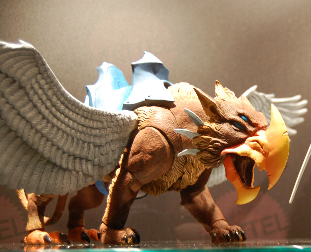
Next up, the Griffin. This is based on Beast Man’s ride from the Millennium cartoon (I think…?) and is a brilliant example of parts reuse, featuring Battle Cat’s body, Swift Wind’s wings and a new head, feet, tail, and saddle. As much as I like that it’s a MOTUC figure, it’s also a pretty good representation of the mythological animal. I’ll admit to being a bit underwhelmed when I first saw the figure, but now I’m really starting to warm up to it.
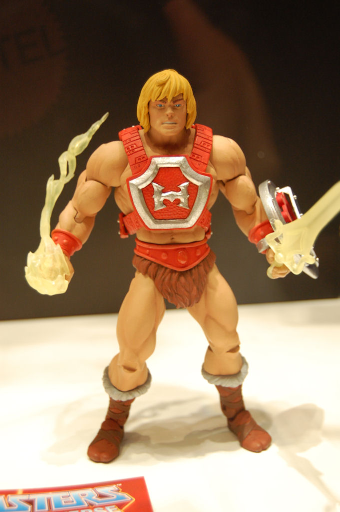
I can’t say I’m very excited for Thunder Punch He-Man. I never owned the vintage figure and I don’t find his design different enough from the regular He-Man to be very interesting…though I do like the little energy blast accessory.
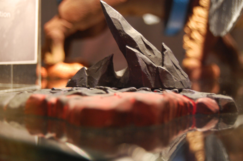
The Snake Mountain stands look great, and I’ll buy one set, but I do wish these were cheaper–if they were, I might buy one for every MOTUC figure I own.
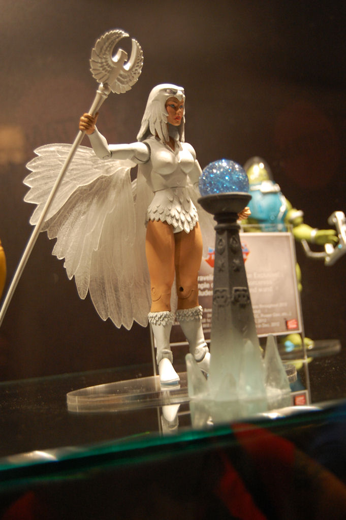
The all-white Temple of Darkness Sorceress I will be buying solely because I am a completist on MOTUC, and because I want the stand for King Grayskull’s Ball of Sparkle Crest.
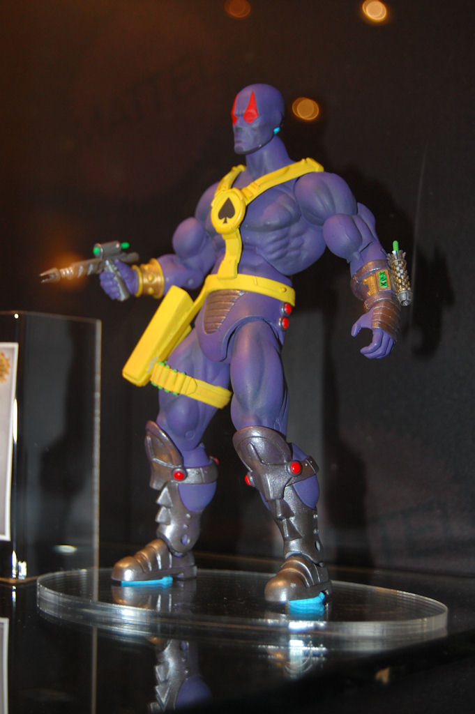
And then…there’s Spector, who has created perhaps the biggest controversy surrounding MOTUC since the inception of the line itself.
First off, let me say this: if I were in Scott Neitlich’s position, I definitely would have done whatever I could to design or help design one of the 30th Anniversary figures. I don’t begrudge him that. But by making a figure based on his own adolescent design for the Create-a-Character contest, many fans interpreted this as a massive act of egotism, another example of Neitlich using MOTUC as his own personal playground.
Setting aside that question, I do think it was a mistake for Neitlich to base the figure so closely on his childhood design (assuming that’s indeed what happened; I’m giving him something of the benefit of the doubt on that). Even if he did want to create a Spector figure, he probably should have revisited the concept and brought in other designers to develop it more. Very few things one creates as an adolescent will stand up to scrutiny years later (just ask my juvenile short story parody Star Heck 1: Encounter at Fartpoint). The silence that reportedly greeted Spector’s reveal at PowerCon is a testament to that.
One possible example of that juvenile origin is the incongruous playing card motif. If Spector is a time traveler, it would make a lot more sense for his chest emblem to be a clock rather than a spade. Or if you’re set on the playing card thing, why not give him powers related to luck or probability, like Longshot?
A lot of fans have complained that Spector looks too much like a superhero and therefore doesn’t fit in MOTUC. Nuts to that, I say. NUTS! This is a toyline that has featured chaps-wearing cowboys, ninjas and S&M enthusiasts; I think it can handle a guy who looks vaguely superhero-ish.
But enough; here’s what I think of the design, setting aside questions of motifs and superheroes. Yes, it’s a little boring. Moreover, he doesn’t quite fit the MOTU design aesthetic. He needs a “hook” of some sort, something to give him more character.
In sum, I don’t hate Spector to the degree that many seem to, but he’s definitely not a figure I’m excited about. Mattel should consider adding a really kick-ass accessory to his package, e.g., Keldor’s swords or the Staff of Avion.
Ryan
I don't frequent the forums on He-Man.org, but here's a REALLY good use for your Spector, if you are like me and agree with all of Poe's comments about it. I really agree that Mattel should not be humoring the whims of their brand manager's ego. If I ran the line, I would at least have the respect to separate myself from it. And I could tell the very first time I saw it that Scott grew up in the 90's reading Image comics. It will be the first figure after Mo-Lar that I won't be including.
Anyway, I digress – here's a good use for your Spector with not a lot of work! the basic blandness of Spector and the color scheme will lend it perfectly for those that are hoping to find a home for the alternate U.K. head of Horde Prime:
http://www.he-man.org/forums/boards/showthread.ph…
Thrawn
I love everything that was shown.
I think Spector looks neat.
I was really surprised by the griffin. The more beasts they can give us the better in my opinion.
The snake mountain stands look good from what I’ve seen.
I love the all white Sorceress.
Slush Head looks great.
Stinkor stole the show for me. He looks as close to perfect as he can be. I would have preferred for him to have Hordak feet, but that’s a minor quibble.
Both him and Fisto demonstrate how every figure should be done in this line.
Looking at them, I’m at a loss why Buzz-Off and Clawful couldn’t have gotten alternate heads too.
That still irritates me. But hey…at least Stinkor and Fisto absolutely rock.
Kid Nicky
I've resisted buying any Mattycollector fig so far (I did buy the Skeletor/Luthor set at TRU.
That said,thunder punch is MY He-Man,and I NEED to get him!!!
When's he come out?
Thomas b
Yeah. That’s what I thought too but I just let him keep talking. Maybe he submitted it to Mattel first and then marvel. Either way it was a villain for the Marvel submission.
@RobotsPJs
That's exactly how I feel about the Specter. He's not necessarily bad, he just needs more of a hook. Yeah, there's a cowboy, but he's got LASERS! Something along that line would save him for me.
@MetTiinA
I don't think the Griffin really works as a generic representation; the enormous axe-beak, four eyes and two-tipped tail just scream MYP. I'm frankly amazed it wasn't teemed too anime hyper-detailed for MOTUC. I guess it helps it doesn't have wind-swept hair…
Stinkor did get plenty of millennium accessories, but I believe those are all removable, even the little gas mask on the face. And the sculpt behind it is more of a modified vintage Mer-Man than anything else. I'm really happy with how you can have him as either vintage or modern or a mixture of both. After Fisto and now Stinkor It does seem like the limitation on 200X details only applies to face sculpts and non-removable detail.
Spector still looks like a DCUC design that got lost and somehow ended up produced as a MOTUC. In a toyline that encompasses everything and the kitchen sink and the key word for figure design is "insane" more often than not, it just comes off as awfully bland and pedestrian. I wish Scott had tried to come up with something completely new instead of recycling his childhood design.
Zach S.
Regardless of what the story behind the creation of Spector is, the design is just boring, bland and unappealing…and those are usually important characteristics of a product you hope to sell. I guess nobody stood up and mentioned the design was lacking…and the higher ups probably just saw how it probably costs much less than any other MOTUC to produce, in that it uses no new parts and is essentially like releasing a blank standard buck.
I feel no jealousy or whatever…Scott probably worked hard to get where he is, and with his position should come some perks like this. However, I agree that other designers should have come in and helped develop it more.
The only criticism Mattel needs to hear from me, though, is that I won't be buying one. I feel sorry for those that got the 30th Sub and don't want Spector…it might be a tough sell on the secondary market. At least he'll be good custom fodder for customizers though…
Zach S.
I meant "those aren't good characteristics of a product you hope to sell."
wally2974
At first, I though they were trying to slip a figure under the radar(no pun intended). I figured he was supposed to be the mysterious guy flying the Wind Raider on the old poster. How cool would that have been to go along with the Wind Raider coming out this year?
brothermidnight
As soon as I saw the Spector I had a real fear that Mattel had hired Rob Liefeld to design figures for them.The spector looks like he would be right at home in the early 90's Xforce books.
Mecha-Shiva
Spector can be a stand in Ninjor.
Thomas b.
Scott originally submitted Spector to marvel as a kid and it was rejected. He was going to be a gambit villain so it explains the playing card symbol. Then he sub,utter it to mattel. Both companies rejected it. Thus should have been taken as a hint. And a new design should have been used. The character just seems really boring and generic.
Ps I got this info talking to Scott directly at powercon.
@FakeEyes22
I'm not trying to say you or Scott are wrong, but I think there may be some confusion or he got tongue tied while explaining this.
Gambit showed up in comics in 1990, so there's no way he could have been submitted to Marvel for that purpose prior to the create-a-character contest.
I still think Spector's pretty cool, regardless of his origin.
misterbigbo
Stinkor is great, and among the last few figs I want from the line. And though I don’t want a Griffin, I think the design is great, overshado wing the more important cats. And I couldn’t be happier about Thunder Punch He-Man, my favorite fig in the line!
Poe Ghostal
And thanks to Thunder Punch He-Man, we now know there's no problem that can't be punched away–even fire!
R.Ace
Couldn't be happier about Stinkor. Everything looks great, and i'll even go for the Spector.
And it will be cool that Stinkor will stink………….again.
He-Dan
Shhhhh… Don't give Matty ideas such as packing in sought after accessories with unpopular (or craptastic) figure choices..
Ben Leach
So, uh…you're going to let me read "Encounter on Fartpoint," right?
As ridiculous as this may sound, Fearless Photog at least looks like he MIGHT be part of the world of MOTU. Spector does look like he fits in more with DCUC. Then again, we haven't seen the bio card yet, so maybe there's a PERFECTLY sound explanation…