I admit I’ve neglected to write up a post about it, but I did get The Power and the Honor Foundation‘s excellent Volume One: The Art of Masters of the Universe Toy Design. It’s everything the Mattel art book should have been (for the same price). Anyway, the book includes an early concept sketch of Spikor. He’s similar to the final version except the porcupine aspect is played up more – he’s brown and has a more animalistic face. Why Mattel decided to make him purple in the end is beyond me, but I now find it part of what makes the character endearing.
I had the vintage Spikor as a kid. He appealed to me because of his color scheme (I like purple), the fun rubbery spikes, and the odd extendable trident feature. Like Whiplash and Leech, Spikor survived (or post-dated) the day that I gave away many of my He-Man figures to a cousin in Florida. He eventually became a generic monster foe to the likes of the Ninja Turtles.
Spikor was due for a Millennium Staction, but the line ended before it could be made – it existed nowhere outside of a sketch on one of the Millennium MOTU DVDs. You just know it would have been wild. The Classics Spikor, on the other hand, skews very close to the vintage figure. Probably a little too close, even for a fan like me – but I’m getting ahead of myself.
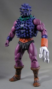
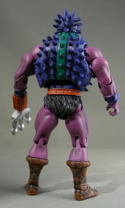
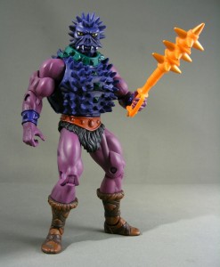
Design & Sculpt: Like most of the more recent MOTU Classics, Spikor’s sculpt hews very closely to the vintage design.
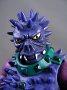
The torso is covered by a pliable plastic armor piece with rubbery spikes. The head sculpt is a Classics-ized version of the vintage one, i.e., more detail but basically the same head. There’s just not a whole lot to discuss here; this is a fairly by-the-numbers update.
Plastic & Paint: There’s a bit more to talk about here. First off, it appears Spikor’s arms and legs and molded in black plastic and then painted light purple. This is bizarre. The initial thought that came to me was that he was produced at the same time as Horde Prime and it was cheaper to mold his limbs in black and then paint them than to have a separate mold run in purple. Unfortunately, this means that whenever and wherever the paint is scratched or flakes, black plastic is exposed.
On the other hand, this does make Spikor look a bit less toy-like than if he’d been molded in purple.
Articulation is standard.
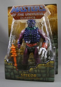
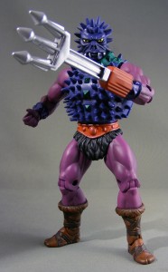
Accessories: Spikor comes with a short trident, a longer “extended” trident, a “hilt” for the trident, an alternate left hand, and an orange mace.
The mace has a nice sculpt, but it’s molded in an incredibly soft orange plastic and will sag like Wonderboy at the end of The Natural.* Mattel’s parsimony strikes again.
The other parts are more interesting. They all have plugs, which means you can plug the trident directly into Spikor’s hand or plug the orange part in and then the trident, as it looked on the vintage figure. The alternate left hand allows you to arrange Spikor as he looked on the 1980s cartoon.
It’s cool they gave us the short and long tridents to mimic the vintage action feature. We’ll see this again next month with Mekaneck.
Quality Control: There’s the aforementioned issue with the purple-paint-over-black-plastic, but aside from that, no problems.
Overall: I loved the vintage Spikor, but for some reason this figure leaves me a little cold. I really can’t put my finger on it. Though I realize this may come off as part of a general souring on MOTUC on my part, I don’t think that’s really what bothers me here. I think this figure just needed some sort of extra oomph…maybe longer spikes, or a more stylized trident, or larger spines on the back…something. Even Webstor got a backpack and extra arms. But I guess these are the trade-offs for declining subscription numbers.
[raven 2.5]
Where to Buy:
*The book, not the movie. And not literally, obviously. As an aside, the book is incredibly depressing. I should know, I had to read and re-read it for weeks to write the Sparknote (that was over ten years ago; they’ve probably rewritten it by now, so I’m not cited as the author). But man, was that a painful experience. Movie’s great though.

