The character of the Sorceress/Goddess was created by Mattel for the original Masters of the Universe line. However, as many fans know, that original Sorceress was referred to as “The Goddess” and featured a design that was ultimately used for Teela instead. When the Sorceress was introduced as a character in the 1980s Filmation cartoon series, she was redesigned to look like the bird-woman we all know and love. Confused yet?
From the admittedly brief research I did for this review, it appears Filmation redesigned the Sorceress for the cartoon, but that would haven’t caused any rights issues for MOTUC even before they secured the Filmation rights because Mattel (finally) produced the much-desired Sorceress figure at the tail end of the line in 1987. It’s worth noting the Filmation cartoon debuted the new look of the Sorceress in 1984, yet we didn’t get a figure of this central character until three years later. Moreover, the Millennium line only gave us an immobile “Staction“ figure, while it took nearly three years – again – to get a Sorceress figure in Masters of the Universe Classics.
Design & Sculpt: This is one of those situations where the sculpt and design of the figure really have to be assessed separately.
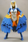
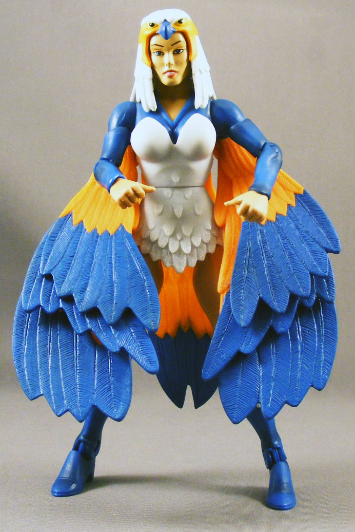
From a sculpting standpoint, the Sorceress is an example of the Four Horsemen (4H)’s fine, consistent work on this line. A few of the parts are re-uses from earlier figures, but most are new, including the head, torso, forearms, “skirt,” upper boots, and, of course, her wings. The skirt and wings feature intricate texturing to evoke the look and feel of feathers.
Some fans wanted the Sorceress to have an open “spell-casting” hand, as the vintage figure did, and even suggested using Catra’s hand. Mattel’s Scott Neitlich stated that this was a design decision made by the Four Horsemen, though after twenty minutes of bleary-eyed searching I was unable to find a comment by the Horsemen confirming this. As for my opinion – I do think a spell-casting hand would have been nice, actually.
Then there’s the design. The execution of the Sorceress’s wings has been the subject of some debate, and even led Mattel to re-engineer them after the initial reveal at SDCC last year (where I think they were just glued to the biceps). To be clear, the 4H don’t always play a role in the engineering of the articulation, and in this case they didn’t, as Mattel brand manager Scott “Toyguru” Neitlich stated.
The goal was for the Sorceress to be able to hold her iconic “wings spread” pose, while also retaining the standard arm articulation. What Mattel’s engineers came up with was a large peg on the back of the shoulder piece, with three wing-parts that rotate on hinges attached to the peg. Each hinge has a particular “stop” point at which it stops falling, so as the arms are raised, the wings fan out. The downside to this system is that the pegs are ugly and obtrusive, and when the arms are moved forward the wings look unnatural.
That said, with the wings spread the figure looks fantastic. But those shoulder pegs were not an elegant solution.
Plastic & Paint: I’m not the best judge of paint – unless a figure looks like an absolute mess, I’m generally satisfied. And the paints on my Sorceress are generally satisfactory. There’s a nice wash on the arms and boots, and the color choices for the orange and blue, while bright, fit the character. My figure does have one noticeable flaw, a bright white scrape on the right foot.
Some fans wanted the blue removed from the inside of the Sorceress’s wings. In the cartoon and comics, the Sorceress’s wings are blue on the back/outside, but entirely orange on the inside. This was also how the vintage figure was done. According to Neitlich, the 4H didn’t like the all-orange look and went with the inner blue.
Having seen a comparison, I like the all-orange look a bit more, and it is more accurate to every medium (with the exception of a variant Staction). It seems a bit inconsistent to be so wholly faithful to the original toys so as to sculpt boring dials, then change something more iconic like this. How many times did we see the Sorceress in this pose at the beginning of every episode?  So I have to disagree with the 4H on this one. It’s okay. Even the best of friends don’t agree all the time.
Articulation: The Sorceress features a ball jointed head, which is limited by the cowl (though it’s made from softer material, so there is some movement); ball jointed shoulders; swivel biceps; hinged elbows; swivel wrists; a hinged waist; hinges at the hips that allow the legs to move back and forth and side to side; hinged knees; and ankles with hinges and “rocker” motion for wider stances.
Many fans have lamented the removal of the swivels on the hips on female MOTUC figures, and I agree it seems like a needless change, particularly when those molds already exist.
Accessories: The Sorceress comes with her staff, the falcon Zoar, and a stand for Zoar. The staff is molded in white and is, well, a staff.
Unlike the Zoar that came with Teela, this time we finally get a proper Zoar with the orange-and-blue coloring, red armor, and red stand like the vintage toy.
Quality Control: Aside from the scratch on my figure’s foot, I didn’t have any significant problems. I believe there may have been a problem with some people’s staffs arriving broken or breaking when the figure is opened.
Overall:Â The best way to describe my opinion of the Sorceress is disappointment. The uninspired wing design and the lack of a spell-casting hand detract from the final product (I’m leaving out the wing paint issue because that seems more like a matter of personal preference). This should have been a figure I was excited to get; instead, she’s at best a mediocre addition to the line.
I’ll admit my enthusiasm for MOTUC is at a low ebb right now, so that could be coloring my impressions here. But I can’t help feeling something could have been done to make this figure special, and it just didn’t happen.
[raven 2]
XeQUae
I liked her, but the way they did the wings is annoying. I have her posed with her arms out and she looks good like that, but it really limits her pose ability.
I would rate her higher, but I can understand why people have problems with her.
Kelektor
Poe, you are right to be critical – and utterly suspicious of anything that comes out of Toypoopoo’s mouth. When Neitlich speaks for 4H or anyone except himself, I switch off, because whatever his reasons he is almost always talking XXL-BS. As for his mythical “suits at Mattel’ and ‘Higher Ups’… what Gordon Gecko world does he think we imagine he lives in?!
Anyway, this is a niche line but it is also a premium line “For the Adult Collector”. Many of us are right to vent disappointment because we are shelling out over twenty dollars online and even more on secondary market for the figures. What a schmuck it makes us feel when ergonomic design of the figures is so unfinessed as Sorceress’s wing pegs or no-spin on Sy-Klone when we had far slicker finishes on earlier versions of these figures at a fraction of the price.
We look at DCUC’s intricate Hawkman or countless elaborate NECA figures and see them proffered for half or less the price of MOTUC but with sleeker design work and more care and attention at post production stage.
Like most liberal minded toy collectors I constantly wrestle with the ethics of whether a poor Asian grandmother cut her fingers assembling my figure but I balk even more when I discover that she may see none of the money I pay vastly more for shoddier collectors’ figures because I’m a certain fan of a certain line.
Time for Mattel to actually listen to fans and not humour us like elderly real estate investors. The 30th Anniversary is a fan anniversary for MOTU a goddam festival – namecheck for ya there, God – not a year of corporate back slapping for Neitlich and pals to soothe his Green Lantern shaped bruises.
Mattel – we need your heart and soul at the party this year, not your outstretched, money-grabbing hand.
Peace out.
RocketPunch
I agree completely with your review Poe. Sorceress was one of my most anticipated characters, so it makes me sad to her turn out so badly.
Robzy
Yeah, this figure is a massive disappointment! The design, the colours… mostly wrong (for me anyway). Plus, as an international customer, it took over 9 weeks to arrive… ridiculous! 9 weeks!! Sadly, I'm not the only one!!
I actually really regret buying it 🙁
The_Fun_has_been_Doubled
Honestly, Dem Wings is the biggest turn-off for me on this figure, closely followed by the Articulation limiting BG Teela legs… (The biggest mistake ever made when they were used on the Star Sisters) I think the only reason I'm keeping My Sorceress is cause it's the First Sorceress Fig I ever gotten… and she's kinda needed on my display… But at the same time it made me NOT want The Temple of Darkness Variant.
PrfktTear
Ditto — I'm not disappointed but I too feel they could have done something different with the wing design — but that said I really can't think of any — its not like Sorceress needs to have any dynamic poses — hell, i take mine out, fiddle with it for a few minutes, then it goes up on the shelf, she doesn't need to be able to have ninja/martial arts poses or anything… i would have liked to have her be able to put her arms out straight, but i can live with that. i guess.
Poe Ghostal
I'm more than happy to have people disagree with me – as always, my review is just my opinion. I'm glad there are others offering contrary opinions. And Michael Crawford gave it 3 1/2 out of 4 stars.
But sometimes figures leave me cold, and the Sorceress was just one of those figures.
PrfktTear
Sometimes you just can't explain it — there is no right or wrong way to feel abou tthese — like when I finally opened my Man-E-Faces, and although he is wonderfully executed and pretty much 100% how I envisioned him — but I still felt a little underwhelmed.
Harrig
I'm sorry you are on a bit of a downer with the line, but I agree with absolutely everything you say. If they wanted the wings spread so badly, they could have made a piece with wings folded, and another with them spread to clip onto the back. They don't seem to be that bothered by working action features in other figures in the line, so why bother now?
On the plus side, this should customise nicely and easily into a good display, although non functional, piece, and that's what I intend to do.
Keep up your candid reviews, they are truly appreciated!
Jesús Santillán
I did not like the torso cut in half or the wings.
AmericanHyena
Attn: Misterbigbo
Re: Your first comment
Brilliant.
Signed,
AmericanHyena
Misterbigbo
After listening to the Roast Gooble episode with Terry Higuchi, I honestly don't know what Mattel should have done to better design her wings. I can see changes that would have improved given poses or improved her articulation, but maybe not both. His only comment that struck me as odd, and I apologize for not being able to quote off the top of my head, had to do with designing the barrels for her wings with durability in mind, as if these toys have ever been known for their toughness!
Anyway, I too am surprised how low you rated her.
André
In my opinion this is a great figure!! I loved the figure and think it woths more points than poe scored!
The only think I think could be better is the wings attached in her arms!! maybe in her back could be better!
ridureyu
The Sorceress always struck me as a very weird furry.
Barbecue17
This year so far has been pretty awesome for MOTUC figures, but I definitely think the Sorceress is the weakest offering so far. (Yes, I'm factoring in the Star Sisters- but they are more of a design/character issue than an execution issue). The small decisions of the wings and the hand really added up to make a disappointing figure.
The Sorceress' wings truly should have lived up to the Classics mantra of no action features breaking up sculpts, as I can't explain what exactly the 'magically opening' wings are but an action feature. So many companies have produced figures of winged characters that turned out better than the Sorceress, including Mattel themselves with Hawkman and Hawkgirl in DCUC. A hard plastic 'cape' really would have been preferrable.
God
Man, it would be nice for once to not have to listen to the overcritical whining and hating about every little thing. I realize the complainers are probably deaf to their own incessant whinging, but to the non obsessed fan/collector, many of you guys just come off as stereotypes crying over every little detail that you don't like.
God
And it also discourages others who would distance themselves from the line due to the kind of people that are it's fan. I know most MOTU collectors are just fine, but the loudest ones are the most pathetic and other, non whiny fans, don't want to associate with you. I know this might anger some people, but this is how the world sees you.
misterbigbo
Dear God,
If you are infallible why do you write so poorly?
Signed,
Mister Bigbo
p.s. I hope this doesn’t wreck things between us, and thank you for sunsets, the laughter of children, and Kate Upton. Huzzah on that one.
God
It's good to see you're keeping ignorance and stupidity alive and well. Good job!
Also, I would appreciate it if you didn't enjoy the things you mentioned above, as I made those for people who didn't turn out to be a disappointment.
Misterbigbo
At least you spelled everything correctly that time, but you still seem angrier than I expected. Is Tuesday "Fire and Brimstone Day" up there behind the Pearly Gates?
John Harmon
Not to talk back to God, but isn't that exactly what reviewers are supposed to do? Pick out details they liked and didn't like about whatever it is they're reviewing?
Saying reviewers nitpick too much is about the same as something someone said a long time ago about a video game review:
"I don't want your opinion on the game, I just want to know if it's good or not."
God
But in most cases it amounts to nothing more than hypocritical whining.
"I hate this lien!!! Her underwear is wrong! His orange is the right "orange! Mattel is screwing us over! This line is an epic failure!!!!! But I can't wait to get soandso next month when he's on sale!"
Barbecue17
Pro-tip: Avoid reading reviews.
PrfktTear
Just the tip.
@RobotsPJs
There's a big difference between incessant whining and a critical review from someone like Poe who CLEARLY is not a whiner as his history of reviews and posts have proven. Perhaps this is your first time on the site, but if you actually knew Poe and his reviews you'd see that he's an even handed dude. He's not a constant complainer.
Jesus
Jeeez Dad… stop embarrassing me in front of my friends!!
idstealer000
Des anyone know if someone fixed the wing situation on her and how they didit? I've been thinking of doing this myself and am curious how it had come out.
ero
You've been critical of the Zoar that came with Teela before, but isn't that Zoar the one from the Grayskull poster?
http://www.poeghostal.com/wp-content/uploads/2009…
I like that the Sorceress came with two gripping hands because it gives those of us with limited shelf space the option of her holding her staff in her iconic pose without it getting in the way (right now she's on the far right of my display, so the staff is held out on her left, away from the faces of other figures).
thrawn
I mostly agree with you Poe. From a sculpting standpoint, she's gorgeous. The face is very pretty, the smile is nice, and the details on the costume, the feathered boots, even the new sleeve piece for the arms are superb.
It's the Mattel design team that nearly killed this figure.
Don't tell me they couldn't have done something similar to Shadow Weaver's get up.
Yes, the iconic pose is nice, but I like to pose and enjoy my figures, that's hard to do when her arms are so limited.
She's definitely not a "bad" figure, but she could have been more.
Dark Angel
Poe, you seem almost apologetic that you don't appreciate the figure more than you do, which is funny to me because I have grown to despise it and can only speak of it with derision. And I still love this line!
So, we cannot have even one open hand, though the arms were sacrificed to the "iconic pose" that will forever be wrong anyway because of the gripping hands and paint? Seriously? That makes sense in someone's head? Fascinating. Really. I assume it would have been "impossible" to just peg those wings to her shoulder blades and let us pose her manually ourselves? Kinda like ball joints in rotocast, right? Also, what is up with the botox-face paint apps? I don't really need my Sorceress to look perpetually surprised, thanks.
I was really looking forward to this figure right up until we saw the final version in Scott's little film before Xmas. I suppose the best I can say is that at least I got the dissappointment out of the way well before tI had the figure in had (WELL before, in light of this year's endless delays)…
Poe Ghostal
"Also, what is up with the botox-face paint apps? I don't really need my Sorceress to look perpetually surprised, thanks."
My wife watches a lot of reality TV, and I came this close to comparing her to Coco Austin.
As for seeming apologetic, well, it's no secret I've known the Horsemen for over a decade, and I always hate to have to go negative about something they created – particularly in this case, where (according to Mattel) at least two of the problems (no open hands and blue inside the wings) was their decision.
Dark Angel
HOLY MOLEY, POE! I’m glad I googled that chick on the phone instead of being lazy and doing it on the work computer… o_O
PrfktTear
"Right click, save"
Monte
There's something of a dispiriting sameness in the female face sculpts in this series.
Also, did they ever end up releasing a version of the Goddess that doesn't break when your neighbor turns on his TV?
Also, I still, all these years into the series, haven't gotten around to nabbing a He-Man figure. If I have a job at the time, I shall do so this summer, methinks.
Poe Ghostal
He-Man is still one of the best figures in the line (though his weapons could seriously use an update – they're really lacking in detail compared to, say, Vikor's weapons).
Reilly
Very good review and I gotta agree that the figure is rather disappointing.
As for quality control, I've seen several figures whose hoods were not glued to the head properly. I had to remove mine, put it back down lower to get the right look.
Poe Ghostal
I forgot, I'd seen that. Even my figure's hood seems a bit too high, though honestly I'm not sure exactly where it's supposed to be.