In the 1960s, as DC Comics developed their revamped Silver Age world of superheroes, they found themselves in a quandary–how could they explain all those earlier adventures of Batman, Superman and other heroes while maintaining the integrity of the new Silver Age stories? Thus was born the DC Multiverse, in which the Golden Age adventures now took place on “Earth-2” while the Silver Age took place in the contemporary “Earth-1.” Once this concept had been introduced, writers immediately began to play with it, introducing other Earths such as Earth-3, a world where Superman is evil and Lex Luthor is good.
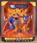
 Alexander Luthor was an acclaimed scientist on his homeworld of Earth-3, one of many “alternate universes,” where history often played out in opposite versions of the Earth we know. When two of his counterparts from Earth-1 & Earth-2 set their sights on conquering his Earth, Alexander enlisted the aid of the evil Luthors’ respective archenemies, the Supermen of their world, to come to [sic] and help fend off the attack. In response, the evil Luthors partnered with Earth-3’s twisted version of Superman, the evil Ultraman, to back their cause.
Born on the planet Krypton of an alternate universe where good and evil are reversed, Ultraman quickly became the most powerful super-criminal of that planet. A mirror-image of Superman, Ultraman had all the powers and abilities of Kal-El, only with the desire to use them for evil. He joined with other super-criminals to form the Crime Syndicate of America, the evil opposite force of the Justice League. Ultraman’s primary opposition came from Alexander Luthor, Sr., a genius scientist devoted to bettering humanity through his inventions.
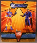

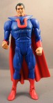

Packaging: Mattel continues to try to appeal to MOC collectors by placing the figures in dynamic positions in the package. Visually, it looks great, but due to the rubbery plastic used to make these figures, it’s still causing problems. When I removed the figures from the package, Ultraman’s leg was twisted outward, as if someone had broken his leg at the knee (ouch). Fortunately, a quick dip in boiling water followed by a dip in freezing water fixed the leg so he can stand, but it still looks a little off.
Design & Sculpt: Many collectors have expressed their wish that Mattel and the Horsemen create modern versions of these characters–or at least Ultraman, who would have been an even easier retool than the Silver Age version seen here.
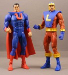
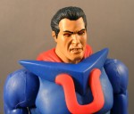
As you can see in the image above, the v-shaped mantle at the top of Ultraman’s chest and the “U” symbol are supposed to look like they’re an embedded part of the suit, as was done on the DC Direct figure. I think that looks terrible–like he stuffed a clothes hanger upside-down in his shirt–but if we want to discuss whether or not it’s accurate to the original design, it’s an important point. Since the Horsemen didn’t have the luxury of sculpting a brand-new chest section and had to retool an existing one, both the “v” and the “u” are and extra piece glued onto the chest.
I actually think the “v” looks better here than on the comic design, so I don’t mind that. But the “u” looks like one of those children’s letter-magnets you put on a refrigerator–it’s too big and cumbersome, and makes the size and obtrusiveness of the chest addition that much more noticeable.
The body is simply a re-use of the same heavily-muscled body we’ve seen before, but there’s another odd exception–the hands. Rather than using the bare hands found on, say, Captain Marvel (which are clearly bare, as evinced by the veins on them), Ultraman has what are clearly gloved hands painted flesh color, making them look swollen and wrinkly (apparently Ultraman was recently given the Melvaran mud flea vaccine).
Some (but not all) of these issues are made up for by the awesome head sculpt. With his red eyes, widow’s peak, clenched teeth and vicious sneer, Ultraman looks like a vampiric Superman. I should add that the cape appears to be a new sculpt, too–a narrower version of the long cape seen on characters like Superman. I’d love to see this cape used on future Superman figures.
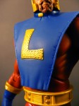
Overall, Alexander Luthor, Sr. fares a bit better. He has more new tooling–specifically his head, tunic, belt, and forearms. The stitching on the edges of the tunic, the “L” symbol, and the forearm cuffs is a great reminder of just how good the Four Horsemen can be when they have a little more room to work.
In order to preserve the ab crunch, the tunic isn’t connected to the belt on either the front or back. It looks a little weird, but this was probably the only reasonable solution to this problem.
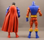
One thing to note: the cuffs on Luthor’s bucanneer boots appear to be upside-down. I’m not sure how noticeable or bothersome collectors will find this, but it’s another example of a QC issue that could have been easily avoided. As far as I can tell this issue seems to be found on ever Alex Luthor.
As goofy as the character design is, I like the head sculpt. (Is it me, or does he kind of look like Christian Bale in Reign of Fire? Yes, I saw Reign of Fire. In the theater, in fact. Hey, we all did some crazy things when we were young.)
Plastic & Paint: Ultraman is molded primarily in blue. His chest attachment is molded in the red of the “u” symbol while the “v” is painted blue, and that’s evident around the edges of the “u.” But the paint work on the head is pretty good, with a good blue drybrush on the black hair. The face itself is a little shiny, but the details are executed fairly well.
Alex Luthor has a lot more paint work, and for the most part it’s pretty sharp. I like the choice of golden yellow for the highlights, and unlike previous figures (such as Captain Marvel or Big Barda), it’s used consistently. There’s a little slop around the forearm cuffs, but nothing glaringly ugly. It’s also worth noting the small rectangular highlights along Luthor’s legs.
Articulation: Both Ultraman and Alex Luthor have the standard DCUC articulation: a ball jointed head, ball jointed shoulders, hinges at the elbows, knees, ankles and abdomen, swivels at the biceps, wrists, lower thighs and waist, and H-hinges at the hips for ball joint-like movement.
Accessories: None–which is unfortunate. It makes sense for Ultraman, but since Alex Luthor appears to be a scientist-type, some sort of weird gadget would have been a nice inclusion, particularly for the $25 price tag on these sets.
Quality Control: There’s the aforementioned Ultraman gloved fists and upside-down boot cuffs on Luthor. Furthermore, Mattel’s factories continue to use weak, probably reground plastic (plastic that’s recycled from leftovers and melted down) on certain parts, particularly the joints, making the figure feel rubbery and flexible–and making problems like the aforementioned twisted Ultraman leg much more common. The figures just feel cheap, and with the upcoming $3 price hike, that’s going to be even harder for collectors to swallow.
Overall:
[raven 2]
I wasn’t thrilled with this set when it was announced, and now that I have the figures I’m still a bit underwhelmed. The QC issues, such as Ultraman’s fists, hurt a lot more when you’re already relatively unexcited by the characters.
There’s a certain carelessness evident in the production of this set, and it’s at odds with the effort the Horsemen put into sculpting it. If these two-packs are going to start costing $30 (or $35!) on Mattycollector, problems like the fists and boot cuffs must stop or the oft-predicted end of DCUC may become a real possibility.