Note: The following is a review by Doc Thomas, and does not necessarily reflect the views of Poe Ghostal. You’ve been warned. –PG

Cy-Chop is the absolute most balls-to-the-wall bizarre action figure in this whole shambolic Masters of the Universe Classics mess. And it IS a mess – between the toyline and the hype and the problems with Digital River and the problems with not-all-inclusive subscriptions and with customer support and and WSODs and reuse and quality control and every other stupid thing that has gone wrong with the whole line it is a CRAZY mess, and there is no disputing that. I have said frequently that long after MOTUC is over we’ll be looking back at it as one of the best action figure lines ever, but that doesn’t mean it wasn’t completely fraught with avoidable nonsense and things worth getting up in arms over, especially considering the premium we pay on these figures.
So here’s Cy-Chop, and he’s weird. I mean, he’s more than just weird, he’s COMPLETELY BIZARRE, and there are a lot of reasons why. There are a lot of reasons to like him, and a lot of reasons NOT to like him. Let’s try to break this down, shall we?
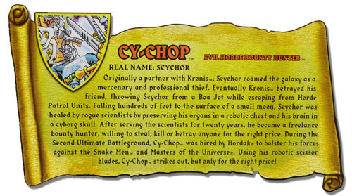


Cy-Chop was designed by Mattel designer Terry Higuchi as his entry into the 30th Anniversary sub-line of MOTUC, which was to be some kind of celebration of Masters of the Universe in ways I’m not really clear on and have never really been clear on. It meant we got the amazing Fearless Photog finally, as well as a bunch of other new figures of new characters that might or might not fit into MOTU. I’m not really sure – as an “anniversary” line, why didn’t it feature some big characters we already know and love? For example, Ram Man would have fit ideally into this line, and perhaps making him slightly more expensive would have made sense for an anniversary sub-line and allowed for more tooling. But, instead, Cy-Chop, a Six Million Dollar Man by way of Frankenstein who fights alongside the Horde in the endless incoherent MOTU mythos made up on the fly. Now, don’t get me wrong, I’m not actually opposed to any of that – I really like the idea of this part-dude-part-machine character with massive scissors fighting alongside Hordak – that completely makes sense to me. (I’m also not opposed to stuff being made up as it goes along, as well as it’s taken lightly and has some kind of editor.) From Poe’s bio discussion I completely agree that “Scythor” would have been a much better, less ridiculous name for the character, but that’s assuming the intent was for him NOT to be ridiculous. As it is, well…
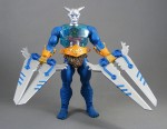
It’s no secret that the entries into the 30th Anniversary Line / design-a-character competition had to be created from existing parts (something I thought was a disgustingly cheap move on Mattel’s behalf, but anyway) but none of the 30th Anniversary figures make this more apparent than the blatantly Frankensteinian Cy-Chop. The combination of clearly mismatching parts with a schizophrenic color scheme make him look completely ridiculous at first glance – even the standard red-and-black Horde logo is now orange and gold for unfathomable reasons – but taking that bio into account, I actually don’t mind the look.
One important reason for this is that, unlike many of the 30th Anniversary figures, I can absolutely see Cy-Chop existing in the classic 1980s line, whereas I can’t see celebrated figures like Castle Grayskullman nor Draego-Man fitting in. Not that those figures are bad, far from it, they’re excellent, and they completely work as adult collectibles whereas Cy-Chop would make an excellent MOTU children’s toy, complete with arm swinging action feature and spring-closing blades. I think people forget just how much the original series centered around the action features, with most of the characters defined by them, thus overlooking how quickly an ’80s Draego-Man with its wings would just break, or how limited a Castle Grayskullman would actually be – what action features would these guys even have? As adult collector figures, yay, but for the ’80s line? I’m not sure I’d bet on it.
Plus, with Cy-Chop’s exposed guts, kids would love him, kind of like how we adored the creepy blooooooood inside Mosquitor. It’s gross and awesome, and completely makes sense. I can even picture him in the POP cartoon, wherein his hilariously over-sized blades would be completely ineffectual, as most kid’s cartoon weapons prove to be. And, for as little as I care about the MOTUC bios I like that Cy-Chop’s gives him some context and explanation, and I kind of dig the idea that he’s been built and recruited into the Horde, where his mechanical bits fit in alongside Hordak.
Cy-Chop comes in the same standard MOTUC packaging as the rest, with the additional 30th Anniversary insignia, which will suit the MOC collectors for line consistency.
His sculpt and paint, is…well, let’s start with the bad. The absolute worst part of the figure is the head, which features a reasonably interesting knight-helmeted-martian sculpt complimented by flat, boring silver paint that has no highlights or detail. It’s crap. If this thing had some kind of screaming skull head, or had been painted to look more Frankenstein and less T-1000, or had ANYTHING INTERESTING GOING ON it would have been great – instead, it looks like an unfinished prototype. For this figure – one of only six in the “special” 30th Anniversary line – for the premium cost with shipping, this is UNFORGIVABLE. Only the eyes are painted, and they look like garbage. Why blue instead of red? Why the predominance of blue, just like Sir Laser-Lot? WHY DOES HE NOT HAVE AN AWESOME SCREAMING SKULL INSTEAD, MAYBE ONE THAT IS ON FIRE?! HOW AWESOME WOULD THAT HAVE BEEN?! Regardless, his plain silver head matches his plain silver neck which matches NOTHING else on his body, making him even more of a mismatched super-strange mess.
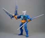
What really makes me crazy is that you can see all over Cy-Chop EXACTLY the parts reused and from what figure – for instance, the belt from Trapjaw, complete with the loops, which so importantly held the extra interchangeable pieces, but here just look like nonsense, complete with the screaming neon orange color. Why?! Sure, the orange and gold (a GOLD Horde logo?!?!) matches the technological crap on his forearms, but then why is his upper arms and lower half all Sasquatch, taken from Beast Man? It makes no sense and doesn’t look good – just odd. Fortunately, the eyes aren’t drawn to this nonsense, rather than to the over-sized scissor-weapons, which are preposterously huge. They’re stupid, but the GOOD stupid – exactly the stupid I expect from Masters of the Universe. They’re big and over-sized and impractical and I can ABSOLUTELY see them in the ’80s cartoons, either alongside Skeletor or fighting with the Horde against She-Ra. Despite their size, they don’t make him top-heavy, and they can be used for a few neat (albeit COMPLETELY IMPRACTICAL) poses. These are the one thing I think makes complete sense for this figure, and nearly sell me on liking the thing. Like Trap Jaw’s interchangeable attachments these can be removed and any of Trap Jaw’s/Horde Prime‘s/Roboto‘s etc bits can go on him instead, though I don’t see why you’d want to do this aside from brief curiosity.
Cy-Chop features the standard MOTUC articulation and no accessories, although the raw size of his blades make up for this; unlike many of the MOTUC, I don’t feel shortchanged getting no extras for Cy-Chop. After all, it’s not like he could hold them anyway! Adding interchangeable parts for the wrists would take away from the fact that he is a scissor-man, not an interchangeable-arms-guy like Trap Jaw, but the fact that one can switch parts with that guy is pleasing. The other “gimmick” we have here is the clear-chest piece with the guts inside, but it’s much better in theory than execution – I’d have liked more detail and organs inside rather than the fairly plain cog-and-sausage that we got. It’s still kind of cool, but not the heights I’d want for the cost. Not that a McFarlane BLOODY EXPOSED HEART and WOMB or some crap would have been fitting, but compare what we have inside here to the awesome clockwork insides of Roboto to get an idea why I feel shortchanged.
Overall, Cy-Chop is a completely bizarre action figure. As much as I like him in concept and his big ridiculous blades, his strange slapped-together sculpt and awful paint don’t hold up to close examination. I want to reiterate how annoying the overall orange-and-teal color scheme is; this toy might have looked amazing with different colors, much like the similarly and rightfully maligned Sir Laser Lot. He actually looks pretty terrific displayed alongside the other Horde toys, something I wasn’t expecting especially given his nonsensical golden Horde logo, and I’ve had a lot of fun playing with him – perhaps more fun than a lot of MOTUC recently – but this doesn’t make his flaws any less inexcusable. Neither the best nor the worst in the MOTUC line, he’s dead average, right in the middle.
[raven 2.5]
Where to Buy: